As expected, Google today introduced a new way to navigate Android with gestures instead of virtual buttons, and it's sure to spur opinions among both Android and iOS users. But while it might seem like a blatant rip-off of Apple's iPhone X navigation, Google's method—which is says it's been working on since before the iPhone X landed—differs from Apple's in meaningful ways. The early beta suggests that the experience will actually improve on Android's speed and intuition. Here are four reasons why we're looking forward to it on the Pixel and other Android P phones, and four reasons why we're not:
How Android P's navigation is better than the iPhone X's
It's optional
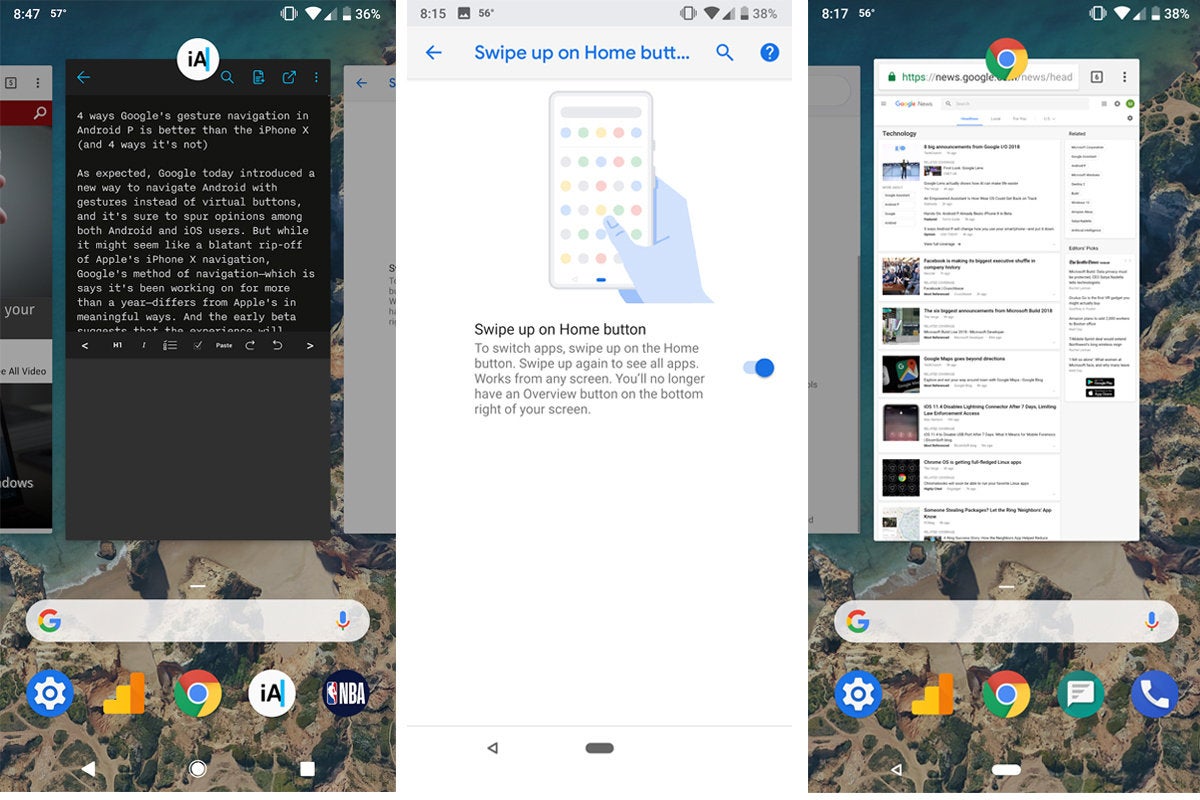
The biggest difference between the gesture navigation in iOS 11 and Android P is that Google is letting you switch it on and off. Head over to the new Gestures menu in Settings and you'll find a Swipe up on Home Button toggle that will enable the new system, elongating the home button and removing the square tasks button. Don't like it? Just switch it off to go back to the old nav bar.
The home button is also a scroll bar
On the iPhone X, the navigation bar is little more than a line at the button of the screen that Apple calls a "home indicator." But on Android it's still a virtual button. That means you can still long-press it to bring up Google Assistant, but it also has a new trick: scrolling. Swipe to the left or right on the new home button, and you'll instantly be taken to the app carousel, where you can scroll to select an app. It's super-easy and actually makes it quicker to jump back and forth between apps.
 IDG
IDGYou can grab text in the app switcher
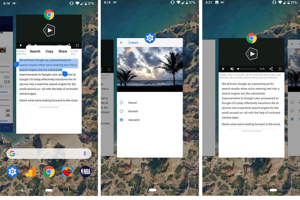
When you swipe up to enter the app switcher on Android P, you're not just looking at visual snapshots of the apps you recently used—they're actually dynamic images that you can interact with. Like the iPhone X, you can swipe up on one of the screens to quit it, but you can also long press inside them to select text. From here, you can move the handles to select the words you want, and copy, search, or translate what's between them, all without opening the app.
Smart shortcuts make switching even quicker
When you swipe up to enter the multitasking carousel in Android P, you won't just get a scrollable set of your most recent screens. You'll also see shortcuts to five predictive apps curated using Google's on-device machine learning. Apple does something similar with its Siri suggestions on the Spotlight search screen, but it's much handier on Android P.
 Daniel Masaoka
How the iPhone X's navigation is better than Android P's
The nav bar is much smaller
Granted, things might change before the final release, but as it stands, Google's new gesture-based navigation bar doesn't actually save any space on the bottom of the phone. While the home button is smaller, the space around it is basically the same, which doesn't make a lot of sense. On the iPhone X, Apple's new home indicator takes up just a sliver of home screen real estate, which is how I like it.
It doesn't need a back button
The back and recents buttons have been mainstays of Android since the early days, but the new gesture-based navigation puts an end to it. Sort of. When you enable the new system, your recents/overview button will disappear, but the back button oddly remains in the same spot to the left of the home button (though it only pops up when there's something to go back to). If Google wants to re-train Android users to use gestures instead of virtual buttons, they need to go all-in, not provide an oddly placed crutch. There are any number of ways Google could have implemented a gesture-based back button, most obviously by swiping from the edge of the screen.
 IDG
IDGYou can gesture back to the home screen
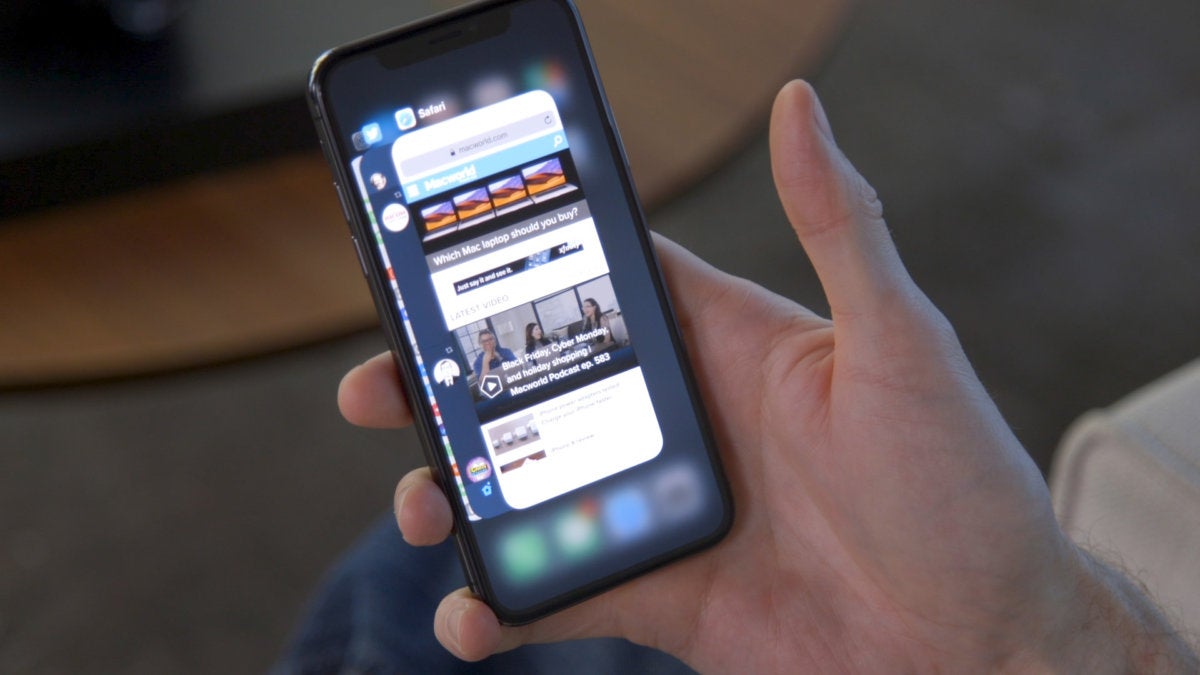
While we can argue whether Android P's scrollable home button is better than Apple's swipe-back-and-forward method to quickly change apps, the iPhone X definitely has a leg-up when it comes to closing apps. When you're in an app on your iPhone X, you can just swipe from the bottom of the screen to minimize it and return to the home screen, but on Android P you still need to press the virtual home button like before. It's a fluid, intuitive gesture on iPhone X, while on Android P it still feels like Google is keeping one foot in the past.
You can see more than one app at a time in the carousel
Among the many differences between iOS and Android is the orientation of the app switcher. That's changing in Android P, as Google is changing the direction of the app switcher to be horizontal rather than vertical. It's mainly because of the new scrolling bar, which makes sense visually, but Google's UI cuts down on how much you can actually see on your screen. Instead of being able to see icons for your last 3-4 apps and quickly tap to switch between them, you'll need to swipe left to see past the latest app you used. Because the screens overlap on iPhone X, you can see several at once and jump to a new app much more quickly.
No comments:
Post a Comment